Image

Double Page Spread

Double Page Spread

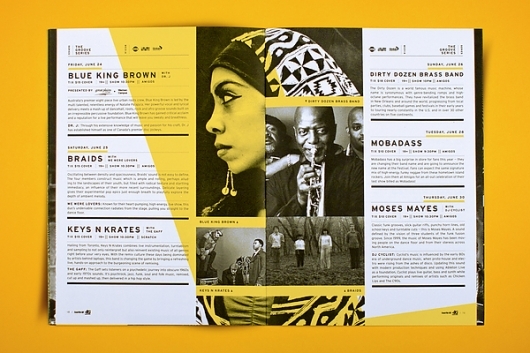
After learning quite a bit about Adobe Indesign I decided to look at double page spreads that were most likely done in Indesign. The spread I chose is rather complex yet simple at the same time. The page numbers ars at the bottom of the page along with the title and logo at the top and bottom of the page were most likely on the master page. The designer also used several character styles.The type above the yellow lines in each section, the larger sans serif type below the yellow lines in each section, the body text, the photo caption text, and the small text to the right and bottom of the larger sans serif font are all different character styles that would have made creating the design a lot easier and faster. All of the type is right aligned which makes for easy legibility. The rules, or lines, to seperate each body of text was probably copy and pasted or option dragged to avoid having to make the same line multiple times. The images were all placed in the document using command+D and then scaled to the correct size by holding down shift+command. The yellow shape was probably created using the pen tool and was filled with yellow with a low opacity. Or the layer could have been set to color overlay so that the yellow was still vibrant but the text and images under it could still be legible and easily seen. The lines of a photo on either side of the composition help to keep the page condensed into the space and ties the pictures into the rest of the composition. Those were set in place by just dragging the image to fit that size without holding down any other keys so the image was basically cropped. The text is all aligned creating a margin. I would think the designer selected all of the sections and then aligned the left edges. Overall, I think the composition is very interesting and well laid out. The text is clean and easily legible and the images laid out in an interesting unpredictable way. The yellow also creates an interesting element and is well tied in to the whole composition by having yellow lines underlining some text in each section.

Image

Hawk Nelson

Hawk Nelson

I found this album cover online and thought it was a great example of a complex design done with Adobe Illustrator. I was first drawn to the text at the top of the cover that reads, “Hawk Nelson is my friend.” The text is centered and is able to have the distressed look from a brush stroke. The first letter of each small red orange word has a swirl which was probably done using the twirl tool after creating outlines on text. The swirled bracket border around the type was probably created using the pen tool and then copied, reflected, and filled with different colors. The buildings in the back have a sense of dimension because of their two toned quality. I don’t think they used the perspective tool only because it looks more hand-drawn and not as perfect. The windows look like they were probably made using the rectangle tool and then may have been slightly distorted using the direct selection tool and moving certain points in or out. The little alien creatures were also created using the pen tool. The pen tool was used for practically everything in the composition. I think one of the most important things to remember when creating a composition like this would be to use a lot of layers. I would think almost every individual creature was on its own layer and then the chunk of buildings in the back right are a layer and then the back left buildings are on another layer. Layering the layers in the correct order would be crucial as well as using the bring to front/back on the individual layers. The faces on the little people were probably edited in Adobe Photoshop and then brought in to illustrator. The composition is very busy however I think it works because of the color choices. They are all very subtle and calm so the viewer is not completely overwhelmed. They also stick to three colors colors throughout the composition which also helps with making the busy composition a little less busy. I think the composition works to draw the viewer in and almost create a story when looking at the image.

Image

Great Wall of China

Great Wall of China

I found this print advertisement for AT&T online and thought it was very interesting. I think photoshop was used the majority of the time and then illustrator and indesign may have been used as well. The first thing that caught my attention was the hands. More than likely, the designer started off with a picture of hands holding the blackberry and then placed a picture over the top and deleted all of the area that wasn’t forming the hands. However, the designers placement was very specific seeing that the shadows still work well and the hands look identical to hands. The image may have been put in at a low fill/opacity so that some of the wrinkles, especially in the right thumb, could still be seen. There is a shadow on the hands from the blackberry which helps create depth. The blackberry looks very smooth and almost a little fake. Therefore, I think the blackberry may have been designed in illustrator or it was a photo that was edited in photoshop. The background of the ad has a radial gradient that is light blue at the top in the middle and then tuns to a sea green as it moves outward. These colors tie in well with the colors on the hands without blending in too much. The bottom orange strip was probably created using the pen tool or the box tool that was than transformed by using the direct selection arrow. All of the type was set in an off white that seems to match the color of the bright spots of the Great Wall of China. I think the final layout was done in illustrator as a double page spread. The composition works nicely and is very interesting, especially the hands. I like how the artist was able to add the image to the hands instead of putting it in the background because that would have been too distracting. The ad definitely gets the point across even without the type so I think that makes the ad pretty successful.

Image

An Object of Beauty

An Object of Beauty

I saw this book cover in a store the other day and thought it was pretty cool so I looked for it online. The cover was probably created in Adobe photoshop. The first thing the designer did was find a photo they wanted as the background and opened it in photoshop. They then typed out the title, novel, and the authors name and aligned it all on the right. Because of the large type size i’m sure the type had to be kerned as well. The designer then selected the type while on the type layer and while it was on top of the background picture. With the type selected, the artist then held down shift and also selected the large counters of the type such as the counters in the A,B,and O. The designer then inverted the selection by holding down command+I. This way when the designer pressed delete when on the background picture layer, the picture would remain in the shapes of the letters. I think this is an interesting way to have a typographic cover while still using photography. However, by designing it this way the type is still the main focal point and the photograph is simply used for decoration and beauty. I think the cover was very well designed and would attract a female audience.

Image

ZERO 7

ZERO 7

I found this poster online and think it is very interesting due to its use of color and subject matter. I think it was created in Adobe Illustrator and the pen tool was used a lot. The astronaut was created using pen tool and is separated into a lot of different little pieces especially around the elbow and knees. The astronaut was filled with an off white and then was filled with blue on the right side to give a sense of depth and shadow. The blue was probably created using the pen tool as well. The head, which I find most interesting, draws my attention because of the number of heads and the different colors used. The heads look like they were made using the pen tool and then copied and rotated multiple times. All the heads of a slightly different shape so when the artist copied and rotated he/she also moved the anchor points a little bit. The heads are filled with either blue or yellow with a low opacity. The blue is on top so the yellow can be seen through the blue making a greenish color. The eyes on the yellow heads are bright red and the eyes on the blue heads are more of a maroon. The background looks as though it was just filled with a dark navy and then very small blue circles were used to resemble stars or the galaxy in general. The circles get smaller as they move closer to the bottom of the page showing depth. The type was filled in with the same color as the background and then moved to where the top edge of the type was cut off by the background of the navy rectangle. By doing this, th type looks like an extension of the background. The type underneath matches the color of the artist signature which is very subtle but works in bringing the whole composition together. I think the composition as a whole works well to keep the viewer interested. The broken string that was holding on to whatever is in the sky (right corner) creates a sense of motion and leads the eye from the bottom left to the top right. The necessity information is clear and doesn’t conflict with anything else.

Image

Dallas Farmers Market

Dallas Farmers Market

I think this ad/poster for the Dallas Farmers Market is very clever. I think it was made using Adobe Photoshop and Illustrator. The background has a faint yellow radial gradient with the inside being brighter than the outside. The inside of the box has carrots and two kinds of peppers. I think the vegetables could have been photographed and then moved and copied to fill the space, or they were created on illustrator. The vegetables are all pretty smooth and perfectly packaged for them to be real. If the vegetables were made on illustrator, the designer probably made them using the pentool. The vegetables have nice highlights on them, especially the carrots. I think this was done by using the gradient mesh tool. Because the vegetables are all stacked in the box, the move to front/back tool was probably utilized a lot. The box was probably made using the pen tool and filled with red. It looks as though the box has a linear gradient that goes from clear to white at the bottom. The type works well together because it highly contrasts each other. The word fresh is curved which he/she would have done using the type warp tool. There is a small shadow underneath the box and a little one to the right of the box. I think this poster is very creative because it will draw in the fast food lovers as well as the health nuts. The color is used well to draw you into the design and keep you there. I am immediately drawn to the red and then move up to see all the vegetables and then move back down and see the logo and then back to the red. I think the poster is very successful and accomplishes its goal of grabbing the attention of the audience and informing them on the farmers market.

Image

John John No. 3

John John No. 3

As I was looking at food on pinterest I came across this chip bag. I was originally drawn to it because of the typography and then I became intrigued by all of the different things going on that somehow go together. The package design was probably designed in Adobe Illustrator because of the large amount of text and the simplicity of it. For the most part, the designer probably just typed out all of the text and aligned where he/she wanted it. The base line for the word THREE is shifted as well as the brackets which was accomplished by rotating the text/symbols while holding down the shift key. The text “aspall cyder vinegar” is evenly spaced between the brackets so the author may have used the evenly distribute tool. The elephant looks as though it was sketched and then scanned in because of its markings. The green side of the bag was made from filling a shape that was most likely created with the pen tool. It was placed behind all the type except the elephant was placed behind the green. The green must have a lower opacity because you can still see the elephant behind the green. The anchor at the top is very symmetrical. It looks like the designer made half of the anchor and then duplicated it and reflected it. The anchor was probably made with the pen tool and then filled in with a linear gradient with a lighter gold at the top and a lower gold at the bottom. The gold works as the focal point because it is the brightest thing on the page and centered. I think the design as a whole is rather congested and random. I don’t think each part flows all that well and there seems to be multiple fonts (the sans serif, modern serif – three, and roman serif of the made in Britain). I think using typography for a chip bag could be interesting and attract a different consumer to the product, however this one wasn’t executed all that well.

Image

BAR

BAR

I found this design online and I was first attracted to it because of its simplicity. I think the work could have been created in either Adobe Photoshop or Illustrator. The bottle was probably created using the pentool and was then filled with white. The choice of the two typefaces was chosen well due to their contrasts. The typeface for BAR is a rather tall, skinny sans serif typeface that has a nice contrast between curves and angles whereas the copy is set in a serif typeface that is much more stout and rounded. The word BAR, the dots, and the larger copy type looks as though it were cut and we are seeing the window behind it. The artist probable had the type and circles set in the same color and then told the printer that that certain color was to be cut out. The smaller type would be illegible if cut out so it looks as though it were printed on the bottle in black. The circles were probably aligned using the evenly distribute horizontal/vertical options on the alignment tool. The kerning and word spacing is well done and leaves the design looking very crisp and clean. I thoroughly enjoy the design and would be tempted to step inside if I were of age.

Image

The Other Here

The Other Here

I found this poster design on a website titled DesignInspiration. I think the poster was designed using Adobe Photoshop and Illustrator. The background is a picture of a guy that looks as though it has been highly edited on photoshop. The artist probably added a blur to the image as well as some sort of filter that added grain as well as a filter similar to fragment. I think the rest of the poster (the text and boxes) were created in Illustrator using the perspective tool. When using the perspective tool the artist may have used the pen tool to create the shapes of the boxes. The boxes create interesting eye movement because they lead your eye in different directions on the page. However, my eye is lead off the page rather than to the words because I want to follow the vanishing lines to their point. The different perspectives of the boxes were created by clicking on different sides of the box in the perspective tool. The type also would have been typed on different sides of the box because they are all facing different directions and are in different perspectives. The use of the yellow for the words “BIG DANCE THEATER” works well for contrast however i’m not sure if that’s what I would emphasize on the poster. I think the yellow could have been used on different words to emphasize the more important information such as the date/time. The contrast in font size works well to show hierarchy of information, however, once again, I would have made the date and time a little higher on the scale because that is important information for people to know. The boxes are see through so the artist either left the fill empty or had to create a clipping path for each object so that you could see through. The artist also utilized the move to front/back tool a lot seeing as that the boxes are mingled together in different ways. Overall, I think the poster is interesting upon first glance but could use some help in its logistics.

Image

Type treatment

Type treatment

This type treatment looks like it was created in Adobe Photoshop. They probably started by created a radial gradient background with a light green in the middle and darker mint green on the outside. The type was probably typed out and then was transformed using the 3D tool. However, once the 3D tool has been applied you can’t add any other effects so the artist probably had to duplicate the type layer and then select each face of the 3D type. I would select each side individually and then save the selection so you could easily go back and edit each side. After each side was selected, the artist could go in and add a gradient to each side and then add a lighter flat color on the front to make it seem as though the type is moving back in space. The pyramid shaped floating figures were probably created in the same way. It looks like he then created some bubbles and added a gradient to them to give it a 3D effect. The gradient mesh was probably used for the circles because it can create a variety of gradients. He then made the circles in different sizes and placed them around the composition as if the type was falling through water and creating water bubbles. The artist also created abstract white shapes that look similar to clouds. It looks as though the artist changed the opacity on the “clouds” and placed the word LETS behind one cloud and the rest of the words on top. The other cloud-like shapes are on the sides/corners of the page. Overall, the composition aids the type in that it looks as though the type is falling through the sky. The colors, especially the background color, adding a cool wintery effect which is contradicted by the warm orange of one of the words. However, overall the composition looks like a calm wintery scene with a little spark of life and brightness.