Image

Mayday Parade Album Cover

Mayday Parade Album Cover

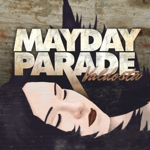
I found this album cover while scrolling through my itunes and realized it had some design qualities we have talked about. It was probably made in Adobe Illustrator. The face was more than likely created using the pen tool and filled using the gradient mesh. The artist either chose skin tone colors or used the eyedropper tool to grab skin tones from an actual picture. It looks like the artist also added a drop shadow under the chin which means the face and neck are two separate shapes. The hair was created with the pen tool and is a separate shape that was placed on top of the face. The type has several ligatures where the letters come together as one shape. The letters were probably transformed into shapes using create outlines. The letters that are combined in to one could have been combined using the merge tool on the pathfinder window. They were able to elongate the stroke of the R by using the direct selection tool, selecting the two bottom anchor points, and dragging down. The letters P, A, and R in PARADE also look like they have a linear gradient on them where it gets darker at the bottom of the letters. The word Valdosta also looks as though it has a lower opacity because you can somewhat see the distress marks through it. The background is probably an image of texture they were able to add some effects to in order to make it look a little more distressed and have the right colors.

Image

The Girl Who Ate Kalamazoo

The Girl Who Ate Kalamazoo

I found this book cover on the internet and thought it was funny because my brother goes to Kalamazoo College. It looks as though it could have been created in Adobe Illustrator and Indesign. The house looks rather simple to where it looks as though it was created in illustrator using the pen tool and shapes. They would have had to use the move to front/back tool a lot as well as using several layers. To fill the different parts of the house they probably used the live paint tool. They may have also added some drop shadows on the house, especially on the left side of the roof and the bottom right. Or they may have just made a dark shape and changed the opacity. The spoon also looks like it was created using the pen tool. It looks as though they used the gradient mesh tool to fill the spoon smoothly with all the different shades of black and white. They also would have had to group all of the parts of the house and then move it behind the spoon. More than likely they were on separate layers so they were able to move the house layer behind the spoon layer. The text was also done by writing on a path. First, they made the circle and then they selected the type on a path tool. The background also has a circular gradient on it that makes the house look like it’s glowing. Otherwise, they could have added an outward glow to the house for that affect. Overall, I think it is a well done design and has good eye movement.

Image

Salad Man

Salad Man

I created this little guy using Adobe Photoshop. I started by opening a document with all the vegetables as their own pictures. I then used different selection tools to select each vegetable and place it on the melon to make a face. I started by using the oval marquee to select the blueberries by placing the arrow near the corner and dragging down to the right size. I moved it over using the arrow keys.. I held down the shift key so that it would be a perfect circle. I then selected the carrot by using the marquee tool again but started the circle in the middle and held down the option and shift key so that the circle would start from the middle and stay perfectly round. We then used the polygonal lasso tool to select the bow tie pasta. To use the lasso you would click where you wanted to start and then a line would appear. You drag the line to the position and length it needs to be and then click again. Repeat that process until you have made it all the way around the shape and you see the closed circle when you hover over the first anchor point. To select the tomato nose I used the lasso tool. To use the lasso tool you click and drag around the shape as close to the edges as possible. If you need to subtract some of the selection or add on to the selection you would use the option key (subtract) and drag around the area or use the shift key (add on) and drag around the area. Then came the ears and eyebrows. I used the magic wand to select the ears and the quick selection to select the eyebrows. The magic wand selects everything that is the same color or close to it depending on the tolerance you give it. In order to only select the middle part of the grapefruit I changed the tolerance to about 45. If some of the inside was not selected I would hold the shift key and click on an area that was still unselected. For the direct selection, you click and drag and the tool will select what it thinks is the area you want to select. Because the eyebrows have a distinct white background the direct selection tool worked well because photoshop was able to pick up where the object was. Last but not least was the magnetic lasso. I used the magnetic lasso to select the mushroom and kiwi. To use the magnetic lasso you click on a starting point along the edge of an object and slowly drag along the outside. The lasso will latch on to the outside of the object and create points along the way. If the lasso is not catching on to a certain area you can click and then keep dragging and it will continue acting like a magnet. After each selection, I made sure I was on the original layer and then option dragged the object over to the melon. I then made each object its own layer, with both eyes on the same layer as well as both ears. I then was able to arrange the layers to have the mushroom behind the melon, the carrots behind the blueberries, and grapefruit behind the melon.

Image

Blending/Live paint

Blending/Live paint

Today we learned how to use the blending tool and live paint tool in Adobe Illustrator. To use the blend tool we made two shapes that were different colors, selected the blending tool (which looks like three shapes all squished in a row), and then clicked both of the shapes. The two shapes became blended together to create one shape. You can change how the blend looks by double clicking on the the blend tool icon and selecting either specified steps, specified distance, or leave it on smooth color. You can also create a path, select the path and a blend you have already made and go to object>blend>replace spine. Then you’re blend will follow the path. You can create a circular blend like the one above by making a circle and then selecting your blend and choose replace spine. However, this will only allow the blend to go around about 3/4 of your circle. So to make it go all the way around, after you make your circle you click on the scissors tool (under the eraser tool) and click anywhere on the circles path. Then you follow the same steps as before.

We also used Live paint to fill the inside of the watering pail we made. In order to use live paint you have to first select all of the objects you are going to paint. Then if you have your swatches open you can fill certain pieces of the objects with one color and then arrow through the other swatches with your keyboard and fill with the other colors. You can also use the live paint selection tool to delete parts of the objects you don’t want to fill or be seen.

Image

Buildings

Buildings


To create these buildings in perspective I used the perspective grid tool on Adobe Illustrator. By clicking the perspective grid icon the grid will automatically appear on the page. You can adjust the height and width of the grid by dragging out the points at the bottom. For this assignment we dragged the right side out a ways to make it longer and then also dragged the top up to make it a little taller. I then selected the shape tool and selected the rectangle tool. In order to know what plane you are about to work on look up at the top left where there is a little tear drop shape bubble with a little box inside. The highlighted part of the box is the perspective the rectangle will be drawn on. You can change the perspective, or side of the box, by using you’re arrow keys. Once the right side of the box is selected move your cursor over the grid and you will see it latch on to the grid. Once you have chosen where to place your rectangle click and drag and it will snap on to the grid and form a rectangle in perspective. I did this several times at different heights and widths to create the different types of buildings. To make a building look like it is going behind the rest you choose the opposite side of the box to work on and drag a rectangle out from the corner of the front rectangle. You then move the new rectangle behind the others. Once I had finished creating all of the buildings I filled each with a gradient and played with adding windows and doors. For the windows I used the rectangle tool again and snapped them on the perspective grid as well. I then added some brushes to them to create the different strokes. I also made a balcony on one by selecting the bottom of the box and dragging out a rectangle. That way the box would be parallel to the ground and still be in perspective. When adding text, type out the text first and then drag it over the grid and it will snap on just like the rectangles. Once I had finished one side of the street I copied it, reflected it, and changed some of the colors and windows to make the two sides look a little different from each other. The background was created using a linear gradient. I also added in sidewalks by using the rectangle tool and latching it on to the bottom perspective.

Image

Jack Johnson Poster

Jack Johnson Poster

I found this Jack Johnson poster online and I was instantly drawn to the simplicity of it. It looks like the guitar was made in Adobe Illustrator with the pen tool. It looks like the guitar has a special stroke on it that makes it look almost like it was hand drawn which works well with the splatter of the blue fill of the guitar. The splatter could have been done in either photoshop or illustrator. I really like the way he did the blue rings around the black circle in the guitar. It looks like it may just be another special type of stroke made really heavy. He definitely had to use the move to front/back tool a lot while creating this guitar, especially on the neck, because there are so many little pieces everywhere. The background has a faint dainty blue design. I think the background works really well which is surprising because one it looks formal while the guitar is a little all over the place. I think the background and text was done in Adobe InDesign. I really love how the two O’s in Johnson are blue and draw your eyes back to the guitar. The two O’s are also a nice reflection of the black circle in the middle of the guitar. Overall, I think this poster was really well executed and is something I could look at for quite some time.

Image

Walgreens Ad

Walgreens Ad

I found this ad flipping through a Vogue magazine. I stopped to look at it because it used a lot of color to create a portrait in a unique way. However, I was surprised when I looked down and saw that it was an ad for Walgreens. I think the ad was created using a couple different programs because it has so much going on. I think the actual objects such as the eye shadow, lip gloss, mascara brush, etc. were all placed in the image using photoshop. The rest of the face is a little bit of a mystery as to how they created it. It looks like watercolor in the background so there’s a possibility they painted the face in watercolor and then scanned it into photoshop and touched it up there. The eyelashes on the right eye definitely look like they were added through photoshop. However, I think the eyelashes were probably created in illustrator and then placed in photoshop. I’m not sure how they were able to arrange the make up powders and allow for the texture to still be visible but i’m sure I will learn as time progresses.

MGL Pots

mgl vases


I created both the vases and my initials in Adobe Illustrator. To create the pots I made a rectangle and used the free distort tool under the distort and transform menu to make the bottom corners come in. I then created another rectangle and merged the two using the merge tool in the pathfinder menu. I added a gradient once the two were merged. I then got the flowers from the symbols menu and moved them behind the pots. For the initials, I started by making a square and filling it with a button from the graphic styles menu. I then clicked appearance and added strokes that way using different colors and stroke weights so I could clearly see them all. Once I was done I dragged the square in to the graphic styles box. I then typed out my initials and clicked create outlines so they would no longer be considered type but rather objects. I then selected the initials and then clicked on the square I had created earlier in the graphic styles box. By doing so, my stokes were applied to the letters.

Image

Self-Portrait

Self-Portrait

For this assignment I took a picture of myself and placed it in Adobe Illustrator. I then selected the photo and auto traced. I selected the six colors option. I then took the photo and went to object>expand. Once the photo had been expanded I used my direct selection tool to select one piece and then went to the select menu and clicked same color. This selected every individual piece of the photo that was the same color and I was able to pick a color from the swatch panel to adjust the colors.

Image

Beetle Graph

Beetle Graph

For this assignment we made graphs by using images instead of the boring old bars. To do so we started by using the graph tool in Adobe Illustrator. I selected the bar graph tool and dragged the marquee to make a rectangle shaped graph. I then entered data in the appropriate boxes and pressed apply. voila. a graph appears. I then went to symbols and chose a symbol I thought would be fun. This time I chose a beetle because I liked the colors. I dragged the beetle onto the page and then selected the line tool and drew a line across the mid-section of the beetle. I then grouped the beetle and line. After I grouped the two I used the direct selection tool to select only the line, went to the View menu, chose guides, and then make guides. Then I selected the line and beetle and went to the Object menu and selected graph>design. I clicked new design once the graph design dialogue opened and the beetle appeared. I renamed it beetle. I then selected the graph, went to the Object menu, selected graph>column, chose the beetle and then clicked the sliding option.